Making an Impact

Campaign image by Ezgi Olukman

Did you know that the average person eats 3496 liters of water each day? Did you know that what you eat and buy directly affects the earth?  What can WE do, as kids, today, to help solve these problems we see in the natural world around us?

We recently concluded our unit on persuasive writing, and the process and products were astounding.  We started by focusing on four topics in small groups: water use, climate change, overfishing, and plastic pollution. From there, the students chose one of the topics to study in depth. As we learned more, the kids started seeing more and more the impact their choices and the choices of their friends. That formed the basis of their thesis statements for their persuasive essays and campaigns.

This was the first unit where from start to finish, all of the resources and assignments were given and received via Google Classroom. It. Was. Transformative. It was so easy to keep track of progress and resources, and it was a breeze to assess and give feedback using Doctopus and Goobric, which work flawlessly with classroom. Next year, my workflow will be much faster and more efficient. I’m really looking forward to it.

Overall, the learning the students demonstrated through their essays and campaings was infused with the passion and excitement of people realizing that they CAN make a change in the world. That the future does depend on them, as it does on all of us.

It turned out to be a meaningful and important end to our year together. I’m excited to refine the unit and extend the eco theme through our new Roots and Shoots club next year. Stay tuned for more eco justice warrior posts!

Ms. Rachel Gabbert
Course 3 Reflection

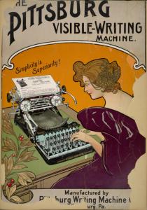
New York public library digital gallery

I have always been drawn to the visual arts. I love designing, creating, and performing. Fortunately, being a teacher I get to do all of those things on a fairly regular basis. After taking CoETaIL course 3, I realized, however, that I could do all of them to such a greater extent. I realized that there were principles of design and visual literacy that I had been overlooking as I created presentations for my students and guided them to create their own.

With media being as prolific as it is in our lives, we all have some experience with visual literacy, whether consciously or unconsciously. This course led me to see that there is a relationship that exists with how an audience interacts with the media, and the relationship is the basis for the message that is conveyed through that media. Even paying attention to how the human eye moves across a web page is a nuanced piece of the author’s attention to his or her audience. The principles of design have the potential to make or break the message you are trying to send.

One of the most challenging but most fun projects in this course was creating the infographic. At Robert’s suggestion I downloaded the Column Five infographics app for the iPad and was instantly hooked. The way they seamlessly blended information and relevant visuals left me spellbound. How on earth was I going to create something of this magnitude? I had a comparative government idea in mind for my topic, I just needed the right application or program to help me. A quick hashtag search on Twitter brought me numerous resources, and from that I chose create.ly. It was clunky, but got the job done. I used some of the Column Five infographics for ideas on how to organize my information, and got to work. I had so much fun designing it, and I am quite pleased with how it turned out. It was also a useful tool for my students to consult as they compared different forms of government. Visual literacy rocks!

Presentations were a place where I was in need of a “refocus.” In my own instruction, I tended to use presentations as a “catch-all” of instructions, information and visuals. Being introduced to Presentation Zen changed that for me. By paying attention to the rule of thirds and taking a minimalist approach, the presentation I created to support my geometric solids introduction in math was one of the best yet. It inspired so much interaction, dialogue and curiosity in my students. I was so pleased with how removing or replacing my text changed how my audience (the students) reacted. It was quite intriguing to see.

Overall, course 3 was by far my favorite of the CoETaIL courses so far. The creativity and practicality of the course kept me engaged and feeling personally accomplished. Principles of design and visual literacy definitely have a permanent place in my classroom.


Rachel Gabbert


Believe it or not: It’s a digital story

It’s nearing the end of the school year, and in grade five we are working on writing personal memoirs that span across the past 12 months. We’ve focused on different methods of autobiographical writing, such as personal narrative, vignettes, poems, and today we introduced snapshots.

A snapshot differs from a personal narrative or vignette in the fact that it is a micro-memoir, often just a few words or sentences, that captures the feel and events of a specific point in time. Cynthia Rylant’s book When I was Young in the Mountains and Ralph Fletcher’s book How to Write your Life Story served as our guides.

This was an opportunity I couldn’t pass up. I had the students reflecting not only on grade five, but on their entire time in elementary school at SSIS.  Why not turn those snapshots into a living, breathing, digital story? From their brainstorming and writing they picked the most vivid snapshot they could remember, and we planned how to organize it into a digital story.

In a wikispaces page 50+ Web2.0 Ways to tell a digital story, it gives a pretty straight forward method of developing a digital story. 1: Outline a story idea. 2: Pick some media. 3: Find a tool to build your story. We had our story ideas, we just needed a way to share our stories. Some students suggested VoiceThread so we could incorporate both images and and voice recording, while others suggested that we create a video. I had my iPad at school today, and one student recommended we set up a “snapshot station” where students could go out and record their snapshot when they’re ready. We decided that to help the reader understand our stories, we would put the setting (more specifically the grade in which the snapshot took place) on a whiteboard in front of the speaker.

Each student shared their snapshot, while groups were in charge of the intro and the conclusion. The song, the theme from Greatest American Hero, is a class favorite and naturally found a place in our digital story. This was an excellent way to practice gathering snapshots for our writing, while creating something that can be used to share our stories. Enjoy the digital story we created today as a part of our memoir unit.

Rachel Gabbert


Pecha What?

some rights reserved by swirlspice

I have to admit, I was not immediately enamored with Pecha Kucha presentations. While I liked the idea that I would only have to listen to someone ramble at me for 6:40, as a presenter it felt so prescribed and inflexible. 20 slides for 20 seconds? What if I only had 19 slides that were good? What if I had 23 seconds of information about one of my slides? Or only 10 seconds? The pecha kucha presentations I had seen did not impress me. Could I do any better?

Once Shane and I came up with a viable idea for a Pecha Kucha presentation, we dragged our feet (full disclosure here). How do we proceed? What do we put on the slides? What do we say? It was easier to ignore the pressing issues than to address them.

When we finally got down to it, it turned out to be relatively enjoyable. It was challenging, keeping book and game reviews to 20 seconds and thinking of more than 10 seconds of information on sand dune sledding, but it was a challenge that we were able to meet.

Pecha-Kucha, which means chit chat in Japanese, turned out to be an interesting and challenging way to create a succinct presentation. Our presentation, focused around awesome things our students can try out this summer, will be a useful resource for our students who are interested in trying some new activities this summer.


Presentation Zen

Some rights reserved Josefe aka Hipnosapo

Especially with my students, I am guilty of cramming as much information and as many instructions as possible into my slides. Granted, I try to space out the information and link them to relevant images that will aid in the students’ understanding and retention of the material. However, when I started becoming “Zen,” my first thoughts were ” how am I going to put all my information in there!?”

Garr Reynolds put together an extremely useful resource on Presentation Zen. He encourages us to slow down and really see the world around us. Design is everywhere, we just have to look for it. I took this into consideration when I was thinking of a way of introducing geometric solids to my students. Since geometric solids (in addition to design) are also all around us, I decided to use big, vivid images as the backdrop for my presentation, making the text minimal.

Starting out, making the images the focus and the text just a complement to them was difficult for me. Luckily, as I went along it became easier and easier to ditch extraneous material and to narrow it down to the core of my message. It began to take shape and not only was aesthetically pleasing, but informative in a not-overwhelming kind of way. Using the Zen principles, I was able to streamline my presentation to maximize both comprehension and visual literacy.

This presentation, when I shared it with my students, was one of the best I had used in my math teaching. It sparked some great dialogue about how and where the students had seen geometric solids in their everyday lives, along with giving them images they can associate with the concepts they learned in math class. Reynolds suggests that Zen presentations encourage the pursuit of discover and nurture curiosity. I hope that from my presentation, students are inspired to see the world around them in from a geometric perspective, one of curiosity and discovery.


Comparative Government Infographic

Phew! After trolling twitter and the web for resources to use to create infographics, I stumbled upon a neat one called Creately. Because the space was limited, I ditched my first elaborate idea of comparing four different kinds of governments using a map of the world then a section for each. Sometimes, with kids and infographics, less is more. I decided on a lighthearted preview of each government, which will be expounded upon as we dive into our comparative government unit. This infographic is intended to get minds rolling with questions about the similarities and differences of governments, what role citizens play in those governments, and what rights (if any) citizens have under those regimes. This infographic will act as a springboard, activating the students’ schemata about government.

The power of graphics is undeniable. In Brain Rules by John Medina, he argues that vision trumps all other senses. He demonstrates that recognition and recall soar when facts are associated with images. In fact, his data concludes that people are able to recall images 90% of the time three days later, and 63% after a year. With all the technology at our fingertips, it’s in our best interest as teachers to use visualization to the fullest.  This is what makes the infographic such a powerful tool in the classroom. Combine the information with a lasting visual and instantly you’ll have something kids will be able to recall down the line.